Today (April 18, 2024), the Australian Bureau of Statistics released the latest - Labour Force,…
ABS revises labour force methodology – things are much worse than we thought
Yesterday, the Australian Bureau of Statistics released an extraordinary press notice – Statement from the Australian Statistician on the Labour Force estimates – which aimed to help everyone understand why the Labour Force data has been so weird lately. A lot of readers E-mail me seeking help understanding what seasonal adjustment is all about. It is a dry topic and not one I relish even though I have a background in statistics and econometrics. But given yesterday’s announcement and the disarray that people have sensed with the official labour force data in Australia recently, I thought I might try a non-technical explanation of what has been going on. Here goes! And for those who like attacks on austerity etc, underpinning this whole discussion is the mindlessness of neo-liberalism. That should get you reading!
Consider the following graph, which shows total monthly employment in Australia from January 2008 to August 2014. I have highlighted the months from November to January in red to make the point.
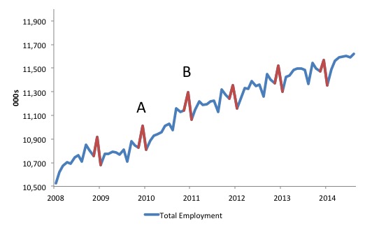
The pattern shown is common in time series data (monthly or quarterly) in almost any data series that you might consider in any nation.
You will immediately notice the red spikes peaking in December. You will also see some other recurring patterns in the data, for example the dip in August.
What is going on?
The answer is that time series data that is below the so-called annual frequency (that is, data which is collected over time and is published on daily, monthly, 3-monthly etc basis) is subject to four main influences or made up of four components.
1. An underlying trend (T) – the overall direction of movement in the data.
2. A cyclical (longer-term) component (C) – the variations arising from cyclical events such as the economic cycle, which recur but not in any systematic way. The cycle moves up and down around the underlying trend in the data.
3. Seasonal (recurring) variations (S) – within a year various seasonal events occur driven by weather, defined holiday periods, notable festivals, school terms, etc. These events thus recur and may have major systematic influences on the data series. The systematic and recurring nature of the variations make them amenable to statistical estimation, which means they can be eliminated
4. Irregular (non-recurring) variations (I) – due to say extreme one-off weather events such as a bushfire or a tsunami that causes havoc with the underlying behaviour that generates the data.
So if we are considering series E (for employment) we could write it as the product of these components as such:
E(t) = T x C X S X I
where the little t in brackets is just what we call a time subscript denoting a particular point in time, say now.
Now ask yourself the question after looking back at the graph above: Is the rise in employment in December 2011 (point B – 11,354.8 thousand) from its November 2011 total (11,240.6 thousand) – an increase of 114.22 thousand (net) jobs (1.01 per cent) a sign of an improving economy or just a consequence of the normal increase in employment in the lead up to the Xmas shopping spree?
If you compare the November-December rise in 2010, you would see employment rose by 150.4 thousand in December 2010 (1.35 per cent).
So is that a better month overall than the December boom a year later (in 2011)? Ig the Xmas booms were similar then the labour market was stronger in late 2010 than late 2011.
Further, mid-2008, with the onset of the GFC and before the Federal government had introduced its fiscal stimulus package (the first part of that package came in December 2008), total employment growth came to a halt.
The level of employment flattened out although the December Xmas peak still came. What was the underlying state of the labour market in December 2008? The answer is dead flat but the seasonal peak disguised that. Further, the January seasonal trough (all the casual shop assistants etc are laid off) makes the economy look worse than it actually is in trend terms.
So what was the overall trend movement in late 2008, early 2009?
These are questions that statisticians address through time series decomposition – that is, breaking the variable (in this case employment) up into the theoretical components – T, C, S and I.
So seasonal patterns make it difficult to determine the underlying trend movement in the data. It makes policy formulation difficult if we do not know when the turning points in the cycle are (when it moves from growth to contraction) or what the direction of the economy is heading.
Another example. The Australian government provided a major cash handout in early December 2008 as part of its kickstart plan for an ailing economy. Was the jump in employment in December 2008 just the normal seasonal rise due to Xmas or did the stimulus help?
Seasonal Adjustment
Seasonal adjustment is an ad hoc set of tools designed to estimate the seasonal variation in a time series.
To give you an idea of how it works, here is one approximate smoothing approach (not the one used by the statisticians).
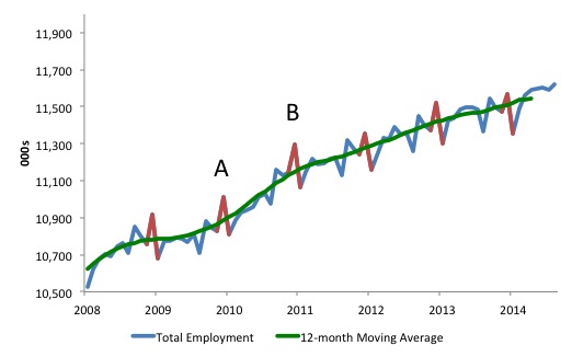
If we took a 12-month (centred) moving average of the data we would produce the green line as shown in the next graph.
Its sounds fancy but is pretty basic. For say the result for January 2009, you would do the following sum:
1. Add the sum of employment in August, September, October, November and December 2008 to the sum of employment from January to July 2009.
2. Divide by 12 to get the average.
3. Do that for all observations (noting you will lose 6 at the start and end of your series).
The average is centred around the observation in question (in this example, January 2009) and the 12 month average eliminates any seasonality within the year.
See how smooth the green line is. All the spiky peaks and troughs are eliminated and we see more clearly what is going on.
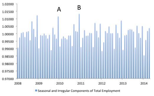
This simple example allows us to eliminate the seasonal and irregular component. For those who like algebra (and it is just simple algebra at that), we can isolate the Trend and Cycle components by dividing the original data by the 12-month Moving Average series we constructed.
This gives what a called the seasonal and irregular factors or components. The following graph shows the result.
So in December 2010, the factor is 1.01158, for example. Which means it is around 101.2 per cent of the smoothed series at that month.
The statistician would then try to eliminate the Irregular component and in that way isolate the seasonal component. Using the smoothing algorithm (statistical technique) that we are looking at here, one way to do that would be to:
1. Average all the values of the Seasonal and Irregular component for every month that the time series is available. So for January, we would average January 2014, January 2013, January 2012 and so on, back to the start of the series. Similarly, February 2014, February 2013, and so on
2. The aim is to further smooth out any irregular events in the data.
3. To then get the seasonal component, we would adjust the averages for each month to make sure they sum to 12 in each year. We can leave the reason for that aside. The point is that then each month will have a seasonal index value around the value of 1.
Then the task is to seasonally adjust the original series by extracting these seasonal components. That involves the following (using our smoothing technique):
1. Divide every monthly observation in the original data series by the monthly seasonal index that you have calculated.
2. This removes the seasonality in the data and the other three components remain.
There are other techniques that are used to detrend the data (take out the underlying trend component) or take out the cyclical component.
The result will be close to the green line in the second graph.
In real life, the national statistical agencies use much more sophisticated techniques to achieve the same end. The US Census Bureau developed the so-called – X-12-ARIMA Seasonal Adjustment Program – which is widely used and freely available at their homepage.
If you want a clear dictionary of all the terms used the US Census Bureau’s – Seasonal Adjustment Glossary – is a good place to start.
The Bank of Spain also developed a methodology called TRAMO-SEATS (Time Series Regression with ARIMA noise) and Signal Extraction in ARIMA Time Series), which is also used by statisticians. It is way beyond a simple blog to explain.
But all these techniques work in a similar way to my simple smoothing algorithm above. They smooth out the seasonal patterns and adjust for moving holidays (Easter), fixed holidays (national days etc), so-called trading day adjustments (this is done because the weekday composition of each calendar month can impart seasonal effects), etc.
The basic idea is that you want to get access to the underlying trend in the data to discern how things are moving free from all the distractions that these seasonal patterns create.
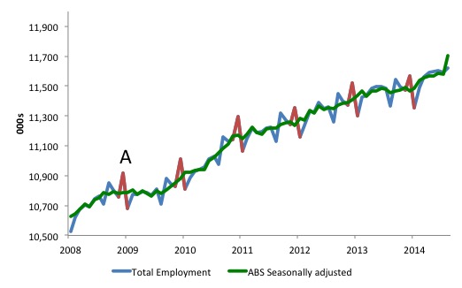
The next graph, by way of interest, is the raw employment series for Australia and the ABS seasonally adjusted series.
Point A is now December 2009 and you can see that the economy was definitely deteriorating at that point despite the euphoria of the Xmas spending. You can see that my simple technique smoothed the data more than the official methodology (compare Graph 2 above with this one). That is just a function of how simple my filter was compared to the official programs.
What it does demonstrate though is that if you want to get a better picture of how the economy is going a 12 month moving average is a pretty good indicator. Not much more information is gleaned using the much more complex ABS technique (which is consistent with all national statistical agencies).
In my regular monthly Labour Force analysis for September 2014 – this segment appeared. I am just summarising it (and added remarks to give today’s analysis context) to avoid you spending time going back to it and then back to here.
I had noted in the August commentary that:
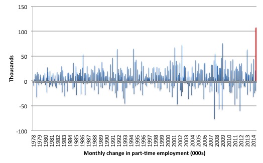
The very strong increase in employment is difficult to believe. To see how much of an outlier it is I produced this graph, which shows the monthly change in part-time employment since February 1978.
Then the the Australian Bureau of Statistics (ABS) circulated a press release – ABS to change seasonal adjustment of monthly labour force estimates – which put the chaotic labour force estimates over the last few months into context.
Effectively, the ABS admitted using seasonal adjustment factors (greater than 1) to adjust the original survey data, when, in fact, they now realise there is no seasonality apparent.
So these factors are the same as I discussed above.
Regular readers will recall that the August data estimated a rise in employment of 121 thousand and the disbelief that I expressed at the time.
Well the ABS is now saying that the actual estimate is closer to 32 thousand once they adjust for their previous errors.
The ABS are now saying that:
As there is little evidence of seasonality in the July, August and September months for 2014, the ABS has decided that for these months the seasonal factors will be set to one (reflecting no seasonality). This means the seasonally adjusted estimates (other than for the aggregate monthly hours worked series) for these months will be the same as the original series and this will result in revisions to the previously published July and August seasonally adjusted estimates.
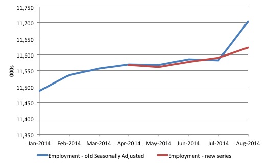
The impact of these admissions is as follows. The original (raw) data estimates of the change in total employment from the Labour Force Survey for July and August 2014 are compared to the previously published seasonally adjusted estimates.
| Month | Original (000s) | SA (000s) |
|---|---|---|
| July | -11.9 | -4.1 |
| August | 32.1 | 121.0 |
The following graph shows the difference from the start of 2014. The blue line is the original seasonally adjusted series published as at August 2014, whereas the red line is the revised seasonally adjusted series published today, which the ABS is now saying is more accurate.
What the ABS are now saying
They have undertaken a review of the problems associated with the labour force survey. First, you can learn about the way the ABS does the Labour Force survey by consulting the latest – Information Paper: Labour Force Survey Sample Design, May 2013.
The techniques are common across the world but the parameters can be influenced by the local politics.
So the Australian government in all its venal stupidity has been cutting the budget of the ABS (to try to generate fiscal surpluses) and this has led to the sample size of the survey being cut, the techniques used to conduct the survey altered, and a loss of skilled staff. Moronic is the softest word we could invoke.
Yesterday, in response to the crisis that has surrounded the recent Labour Force data the ABS is now telling us that:
1. They have “identified changes in the seasonal patterns of most labour force series as a result of changes in the supplementary survey program from February 2014.”
The LF survey is conducted monthly and constitutes a set list of questions. On some months, they add supplementary questions to explore topics of special interest.
It appears that when they changed the timing of these supplementary surveys the seasonal factors that they had been using changed and they didn’t make adjustments to the computer programs used to de-seasonalise the raw data.
The ABS noted:
An effect that has proved to be significant is the change in the timing of the supplementary surveys that are run in conjunction with the labour force survey. In common with similar countries (e.g. Canada), responses to the main labour force survey are affected to some extent by the supplementary surveys. The effects vary, depending on the topics covered by the supplementary surveys and their length. For many years, most of these supplementary surveys were run in the same month each year. As a result, any effects on the original labour force estimates caused by having different supplementary surveys in different months have been largely removed from the seasonally adjusted estimates by the seasonal adjustment process.
2. The ABS changed the method of conducting the survey – “the introduction of web-forms, which can be used by survey respondents as an alternative to being interviewed by telephone or in person” and introduced a “new labour force questionnaire” instrument.
It seems they have concluded these innovations (or austerity cuts!) have not impacted on the accuracy of the seasonal factors.
Their conclusion is that the short-term volatility – big gains and losses in employment – in the last few months:
… of this magnitude is unlikely to reflect labour market reality, so the cumulative evidence from these three months showed that the previously-observed seasonal patterns for these months were not evident in 2014.
They are now embarking on a complete revision of their time series back to February 1978. How are they doing this?
1. They have “systematically assessed the effects of each supplementary survey on the labour force estimates” and with the knowledge gained they are re-estimating “the seasonality of the labour force data with specific adjustments made for the changed pattern of supplementary surveys.”
Tomorrow’s data release will be the first to have this new methodology employed.
2. They will backdate the revisions to December 2013 for now. As time passes and they get more funds they will eventually revise back to February 1978 although they do say that the earlier impacts are “minimal”.
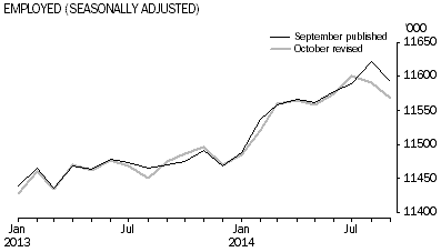
Here is what the difference is for employment. The September published is before they have made this adjustment and the October revised is what they will publish tomorrow under the new methodology.
The differences are quite stark. The previous result showed employment grew by 0.3 per cent in August (adjusted) when the revised result is that it contracted by 0.1 per cent. Employment under the revised data has contracted for the last two months.
A poor result that should rather dramatically change the public debate (but it won’t).
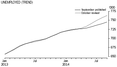
The story for unemployment is similar. The revised September 2014 number is 765 thousand whereas before they claimed it was only 746.6 thousand. So about 22 thousand more unemployed have been discovered by the new algorithm.
The unemployment rate is now estimated to be 6.2 per cent last month rather than 6.1.
The change has also radically altered the trend estimates, which commentators rely on to gain a sense of what is going on.
Here are the revised (and old) trend employment and unemployment graphs produced by the ABS up to September 2014.
The picture presented is very different indeed and better accords with the rest of the analysis I have been doing on the state of the economy and the impacts of the fiscal austerity that this stupid regime is trying to foist on us.
Trend employment
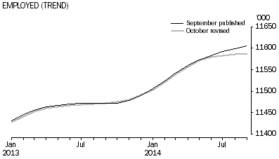
Trend unemployment
Conclusion
Yes, a bit of a different blog today. But I hope it clears a lot of things up for regular readers who are puzzled by these technical issues and do not know where to start.
The point is that the ABS does a great job. But the task is complex and it doesn’t help to have a government cutting the organisation’s resource base.
The other point is that the data the ABS and all national statistical agencies produce is a very important influence on the psychology of the people and the policy debate.
The government can hardly blame the previous regime (Labor) for the increasing mess that the data is showing. The revised data shows that the mess is worse than previously thought.
Austerity is to blame in all its mindless ignorance.
But very good news came my way today
Today I was awarded an Australian Research Council grant for the period 2015-2017 with two colleagues (one from Griffith University and the other from the University of Melbourne). This is the top-level national competitive grant scheme (success rate this year 18 per cent) and the awards a much sought after. Universities see them not only as a source of funding from the Federal government but also as a status symbol.
So my Newcastle research group is happy given they will now have jobs until at least 2017. People like employment and the security it brings. Research centres like the one I run rely on being competitive in these grant schemes for our survival. We are small businesses now as the Federal government cuts into university funding. We have to get this money to survive.
And for centres like CofFEE (Centre of Full Employment and Equity) – we do not enjoy any benefactors with the surname Koch, Peterson or similar. In fact, we have no benefactors. It’s a hard grind but today we are happy.
Overall, the Government cut research funding this year in the DP section that I compete within. Around $7.5 million cut from the total pool (about 2.9 per cent).
Research is one of the sure ways to improve the future. Cutting cash from University research groups is a sure way to undermine that future.
Anyway, despite the pall of austerity hanging over educational and research funding in Australia at the moment, my research group is happy today on a micro scale. We will have a toast tonight.
That is enough for today!
(c) Copyright 2014 William Mitchell. All Rights Reserved.
Congrats on securing the Australian Research Council grant Professor.
I like a bit of vulgarisation on what it is that you econometricians actually do every now and then 🙂
Congratulations on the grant!
Now that is what I call -Wonky.
But I am going to reread it until I get it.
Would there not be other supplemental ways to get employment data cross-checks as well as these ABS surveys? I am suggesting computer database interrogations of existent data (not surveys or collections) to get estimates that can be cross-referenced and cross-checked with the ABS survey data. In particular, I refer to the data held by the Department of Human Services and the Tax Office. The Department of Human Services administers Centrelink, Child Support and Medicare (currently). I am not sure who adminsters DVA but we can include DVA in this question.
DHS, ATO and DVA have an enormous store of up-to-date data on their databases. A monthly interrogation of these databases could extract the following list and more;
(a) The total number of people who paid tax that month;
(b) The number of people who paid tax that month on employed work (PAYE);
(c) The number of people who received DHS and DVA payments that month;
(d) The types of these payments (including of course unemployment payments);
Also, from these and other data sources we could get a monthly estimate of the population of Australia.
Of course, there are various definitions and unemployment and under-employment. This is why the Centrelink unemployment benefits count alone cannot simply be used as an unemployment count.
But I think all the data that is needed is already existent on government data bases. The survey method seems to be archaic; a holdover from another era. What we should be doing is interrogating our databases. For an undefined transition period both methods could be used and cross-checked to gain error estimates etc.
Clearly these large databases are not totally accurate. Some of their data are wrong and some people may be totally off-grid or in the black economy and so on. Nevertheless, the data is very likely to have an accuracy rate at least matching and probably exceeding that of surveys. Internal cross-checking of various counts can refine confidence in various data.
Frankly, in this day and age, I am surprised we don’t take the database interrogation approach. In the long run I suspect it would be cheaper than labour intensive surveying.
It would be nice if they actually listened to what you had to say.
Congrats anyway …
ps Ive purchased your book and Im waiting impatiently for it to arrive.