Today (April 18, 2024), the Australian Bureau of Statistics released the latest - Labour Force,…
US labour market – weaker than 2018 with occupational polarisation evident
Last week’s (August 2, 2019) release by the US Bureau of Labor Statistics (BLS) of their latest labour market data – Employment Situation Summary – August 2019 – reveals a labour market performance that is below the performance achieved in 2018 although there has been considerable month-to-month volatility. The US labour market is still adding jobs, albeit at a slower pace than last year. The Broad labour underutilisation ratio (U-6) remains high even though the official unemployment is plumbing new (recent) lows. And there has been a significant hollowing out of jobs in the median wage area (the so-called ‘middle-class’ jobs), which is reinforcing the polarisation in the income distribution and rising inequality.
Overview for August 2019
- Payroll employment rose by 130,000 – below the 2019 monthly average.
- Total labour force survey employment rose by 590 thousand net (0.38 per cent).
- The seasonally adjusted labour force rose by 571 thousand (0.35 per cent).
- Official unemployment fell by 19 thousand to 6.044 million.
- The official unemployment rate fell marginally to 3.69 per cent (-0.02 points).
- The participation rate rose by 0.2 points to 63.2 per cent but remains well below the peak in December 2006 (66.4 per cent). Adjusting for age effects, the rise in those who have given up looking for work for one reason or another since December 2006 is around 2,182.8 thousand workers. The corresponding unemployment rate would be 4.9 per cent, far higher than the current official rate.
- The broad labour underutilisation measure (U6) rose by 0.2 points to 7.2 per cent largely because of a substantial spike upwards in the part-time for economic reasons cohort (the US indicator of underemployment).
Further, for those who are confused about the difference between the payroll (establishment) data and the household survey data you should read this blog – US labour market is in a deplorable state – where I explain the differences in detail.
Payroll employment trends
The BLS noted that:
Total nonfarm payroll employment increased by 130,000 in August. Job growth has averaged 158,000 per month thus far this year, below the average monthly gain of 223,000 in 2018. In August, employment in federal government rose, largely reflecting the hiring of temporary workers for the 2020 Census. Private-sector employment was up by 96,000, with notable job gains in health care and financial activities and a job loss in mining.
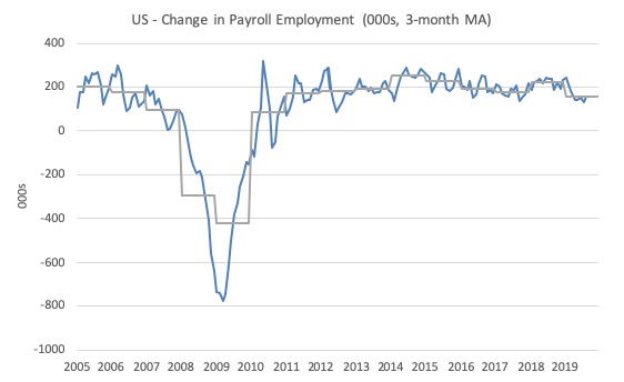
The first graph shows the monthly change in payroll employment (in thousands, expressed as a 3-month moving average to take out the monthly noise). The gray lines are the annual averages.
This month saw the change in payroll employment fall below the average monthly change for the year and well down on 2018 levels.
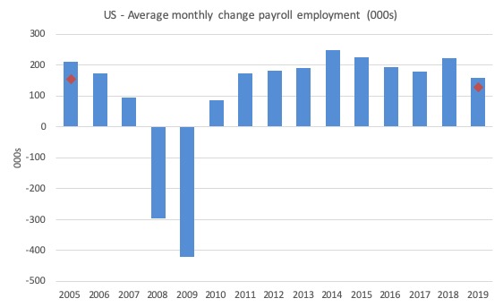
The next graph shows the same data in a different way – in this case the graph shows the average net monthly change in payroll employment (actual) for the calendar years from 2005 to 2019 (the 2019 average being for the first six months at this stage).
The red diamond is the current month’s increase.
The slowdown that began in 2015 continued through 2017 was reversed last year. The 2018 average was 223 thousand compared to 179 thousand in 2017.
So far the average for 2019 is 158 thousand. But within that lower first seven month average is considerable volatility on a month to month basis.
There is a slowing trend evident at present.
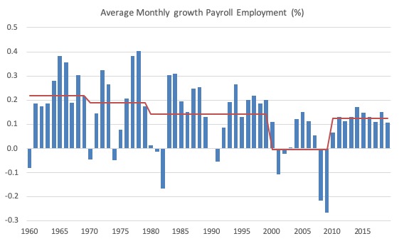
To put the current recovery into historical perspective the following graph shows the average annual growth in payroll employment since 1960 (blue columns) with the decade averages shown by the red line.
It reinforces the view that while payroll employment growth has been steady since the crisis ended, it is still well down on previous decades of growth.
Labour Force Survey – employment growth remains positive
Employment as measured by the household survey rose by 590 thousand net (0.38 per cent) while the labour force rose by 571 thousand (0.35 per cent).
As a result (in accounting terms), total unemployment fell by 19 thousand and the unemployment rate edged downwards to 3.69 per cent (-0.02 points).
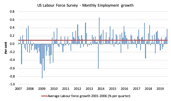
The next graph shows the monthly employment growth since January 2008. The red line is the average labour force growth over the period December 2001 to December 2006 (0.09 per cent per month).
Summary conclusion:
There is still no coherent positive and reinforcing trend in employment growth since the recovery began back in 2009. There are still many months where employment growth, while positive, remains relatively weak when compared to the average labour force growth prior to the crisis or is negative.
There are also months where employment growth is negative.
The last four months have seen increasing growth – which is a positive outlook and appears to be be presenting a slightly different view than that presented by the payroll data.
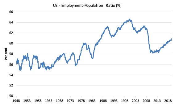
A good measure of the strength of the labour market is the Employment-Population ratio given that the movements are relatively unambiguous because the denominator population is not particularly sensitive to the cycle (unlike the labour force).
The following graph shows the US Employment-Population from January 1970 to August 2019. While the ratio fluctuates a little, the August 2019 ratio rose by 0.2 points to 60.9 per cent. In the last two months, the ratio has been rising after being steady over the previous four months.
Over the longer period though, we see that the ratio remains well down on pre-GFC levels (peak 63.4 per cent in December 2006), which is a further indication of how weak the recovery has been so far and the distance that the US labour market is from being at full capacity (assuming that the December 2006 level was closer to that state).
It is usually a positive sign though when total employment outstrips the underlying growth in the working age population.
Unemployment and underutilisation trends
The first graph shows the official unemployment rate since January 1950 which is currently at 3.69 per cent, slightly lower than the previous month.
It is clear that the US labour market is reaching unemployment rates not seen since the late 1960s (it is slightly lower than the most recent low-point in April 2000).
With inflation stable, the continued low unemployment rates make a mockery of official NAIRU estimates of full employment coinciding with an unemployment rate of 4.6 per cent.
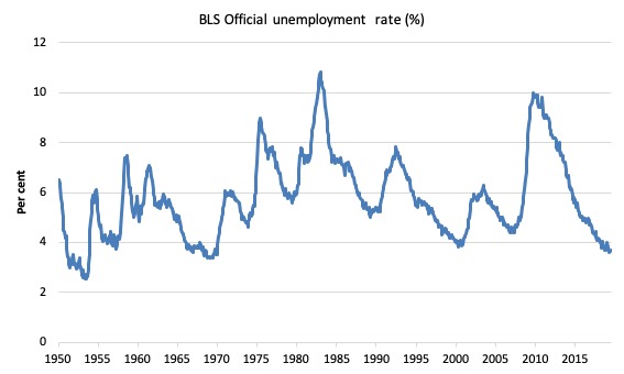
The official unemployment rate is a narrow measure of labour wastage, which means that a strict comparison with the 1960s, for example, in terms of how tight the labour market, has to take into account broader measures of labour underutilisation.
The next graph shows the BLS measure U6, which is defined as:
Total unemployed, plus all marginally attached workers plus total employed part time for economic reasons, as a percent of all civilian labor force plus all marginally attached workers.
It is thus the broadest measure of labour underutilisation that the BLS publish.
In December 2006, before the effects of the slowdown started to impact upon the labour market, the measure was estimated to be 7.9 per cent.
In August 2019 the U6 measure rose by 0.2 points to 7.2 per cent. This was the result of the category ‘Part-time for economic reasons’ rising by 397 thousand or 10 per cent.
However, I doubt that figure. Last month the same measure fell sharply. I suspect that current estimate is closer to the truth.
U-6 was 8.1 per cent at the beginning of 2019.
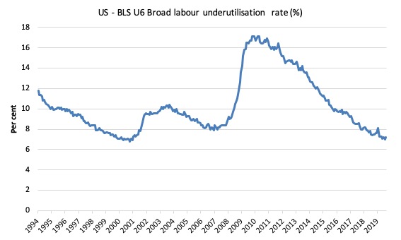
The U-6 measure is marginally below the pre-GFC level but remains above the trough of the early 2000s when it was 6.8 per cent.
While it is signalling improvement, there is still some scope to go before full capacity is reached.
Feature this month: Occupational wage bias intensifies through 2019
I updated my research into the cyclical shifts in employment at the main occupational levels for the US today.
And the results are very interesting.
In the past, I have demonstrated that the proportion of jobs in the total employment in sectors that pay below-average pay has increased.
But at that level of aggregation, we are unable to say whether these jobs in question were high-pay or low-pay.
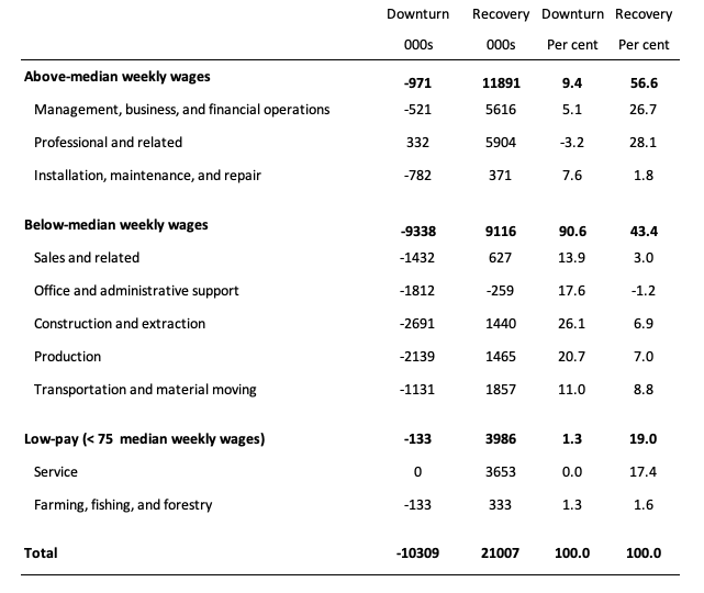
The next table helps to expand on that understanding.
It shows the net job losses (in the downturn) and net job gains (in the recovery to date) for the major occupations in the BLS classification.
I have sorted the occupations relative to median weekly earnings as at the second-quarter 2019.
Low-pay is 75 per cent of the median.
Summary results:
1. In the downturn 90.6 per cent of the jobs lost were in occupations that paid below median weekly earnings (1.3 per cent of those were in low-paid occupations). Very few jobs (relatively) were lost in the higher paying occupations.
2. Given 86.1 per cent of the total jobs lost in the downturn were in sectors paying above average pay. The inference is that the jobs lost were predominantly the lower paying jobs in those sectors (although we cannot strictly compare mean and median in a wage distribution given the skewness).
3. In the upturn to date, the net jobs added have not yet replaced those lost in the occupations with below median weekly earnings. 56.6 per cent of the net jobs added were in occupations with above median weekly earnings.
4. While only a small number and proportion of jobs were lost in the low-pay occupations, the recovery has seen a much larger number of those jobs being added. Of the 43.4 per cent share of below median earning jobs in the recovery the proportion that were in low-pay occupations was 19 per cent.
5. This tells us that there is a polarisation going on in the occupational employment structure with a bias towards low-pay jobs in the below median weekly earnings occupations and towards jobs in the above median weekly earnings.
6. That is there has been a hollowing out around the overall median pay levels.
Conclusion
The August 2019 BLS labour market data release for the US tells me that the US labour market remains below the performance achieved in 2018 although there has been considerable month-to-month volatility.
The Broad labour underutilisation ratio (U-6) remains high even though the official unemployment is plumbing new (recent) lows.
And there has been a significant hollowing out of jobs in the median wage area (the so-called ‘middle-class’ jobs), which is reinforcing the polarisation in the income distribution and rising inequality.
That is enough for today!
(c) Copyright 2019 William Mitchell. All Rights Reserved.
One thing I haven’t understood is why “trial and error” isn’t used for balancing unemployment and inflation. That is, keep expanding jobs “directly” with government sector jobs or “indirectly” via investment to increase private sector jobs *until* inflation starts to increase. Once this happens, the investment decreases. Why bother trying to calculate some estimated “NAIRU” number based on an economic model, when the true, exact data is already available and published at regular intervals! Additionally, the time lag is also quite short for both inflation and labour force statistics
Great piece. Thanks especially for analysis the nature of jobs created so we are not just saying job created job created and so on.
@vote for pedro
“Why bother trying to calculate some estimated “NAIRU” number based on an economic model?”
My suspicion would be that the exercise is to provide a rationale for the labour wastage preferred by oligarchs who disproportionately benefit from the current neoliberal arrangements.